One Warm Color: What an Outside Eye Caught in Our Own Brand Palette
We rebuilt our own brand this year and the palette came out entirely cool. It took a brand strategist about four seconds to say so, and the fix was a single accent color with exactly one job.
Here’s a thing you already know if you do this for a living and still can’t do anything about: you cannot see your own work. You can see a client’s site in thirty seconds. Your own, you’ve stared at for so long that every weird choice has become furniture.
Our rebrand landed on a palette we liked. Periwinkle, a deeper purple underneath it, teal for the small accents, and a set of pale surfaces to sit everything on. Light, airy, plenty of white space. We shipped it and moved on.
Everything was the same temperature
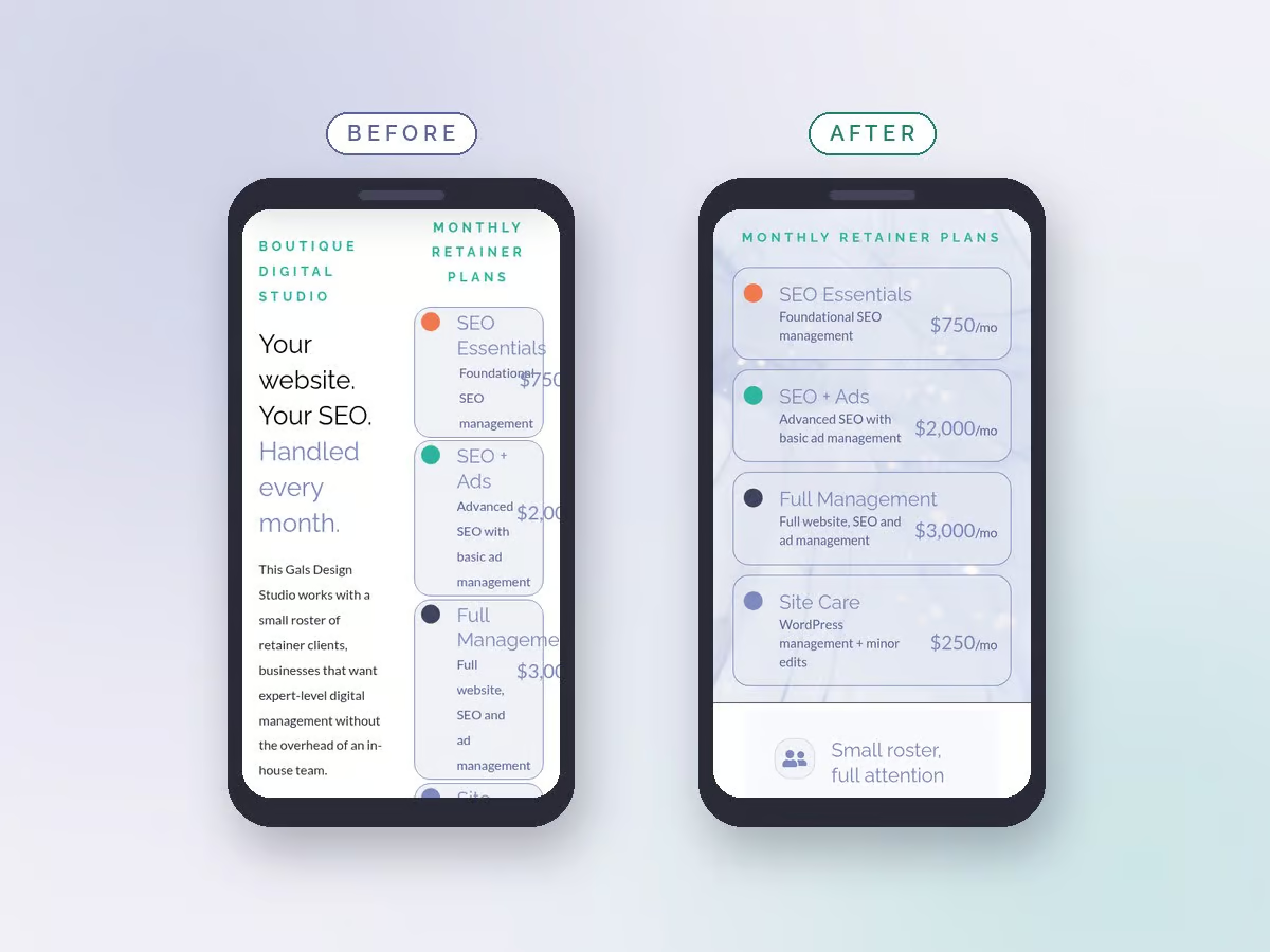
Heather Foelsing at Brandhaüs, a brand strategy studio in Houston, looked at it and flagged the thing we’d been looking straight past. The palette ran entirely cool. Purple is cool. Teal is cool. The surfaces were cool. Even the greys leaned blue.
A fully cool palette isn’t a mistake, exactly. It reads calm and it reads tasteful. What it doesn’t do is tell your eye where to go. When every element sits in the same temperature band, the button and the paragraph and the background are all arguing at the same volume, which means none of them are.
That’s a positioning problem wearing a design costume, and it’s the kind of thing you hire an outside eye for. We’re a search and website studio. She does brand and messaging. She was right and it took her no time at all.
Why coral, specifically
The correction was #F17950, a warm coral. Not a random warm color that happened to look nice against the purple.
Coral sits opposite both the periwinkle and the teal on the color wheel. That matters, because a warm accent that’s near its neighbors reads like an accident, and one that’s directly across from them reads like somebody chose it. With two cool families already in play, the accent has to be genuinely opposite to both or it just becomes a third opinion.
The other half of the answer is quantity. One warm accent in a cool palette reads composed. Two warm colors, or one warm color used in three different roles, reads muddy. The warm note only works while it stays rare.
The rule we gave it
So the color came with a written rule, which is the part people skip. Coral is an accent and nothing else.
The practical payoff is mechanical. If coral appears nowhere else on a page, the eye lands on the button without being asked. On a site whose entire job is getting a warm prospect to book a call, that’s the cheapest conversion work available, and it costs one hex code.
We’ve since rebuilt five pages under that rule. Every one of them has exactly one coral element above the fold, and it’s always the thing we want clicked.
What we can honestly claim
Nothing about conversion rates. Our traffic is low enough that any before and after number would be noise with a percentage sign on it, and we don’t run conversion tracking on our own site because at this volume we know every lead by name.
What we can say is narrower and more useful: every page now has one obvious next action, and it’s obvious without anyone reading a word. That’s a design outcome, not a marketing statistic, and pretending otherwise would be exactly the kind of claim we cut from the rest of the site.
Get someone else to look
The real lesson isn’t about color theory. It’s that we build sites for a living, we know what a flat palette does, and we still shipped one, because it was ours and we’d stopped seeing it.
If you’ve been staring at your own brand for a year and something feels slightly off without you being able to name it, that’s not a failure of taste. That’s just what proximity does. Ask somebody whose job is the part you’re weakest at, and give them permission to be blunt about it.
In This Post
Related Reading