

With the rise of mobile devices, it’s more important than ever to have a website that looks great everywhere it may be seen. Whether your visitors are using a desktop computer, tablet, or smartphone, you want to make sure that your website provides a positive experience. A site that looks good regardless of the user’s device, size of device, and platform is paramount for increasing interaction and traffic to your site.
Here are some tips to help you create a website that looks great on all devices.
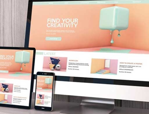
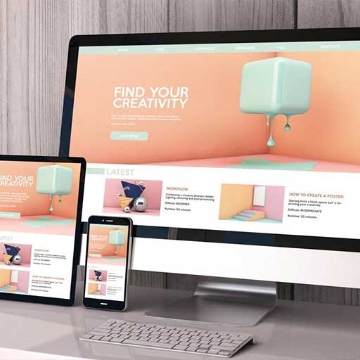
Use responsive design
Responsive design is a technique that allows your website to respond to the user’s device and adjust its layout and content based on the size of the screen. This means that your website will look great on all devices, from large desktop monitors to small smartphone screens. It makes the site easier to navigate and more aesthetically pleasing. Choose a responsive design template, or work with a web developer to create a custom responsive design.
Optimize images and videos
Large images and videos can slow down your website and make it difficult to navigate on mobile devices. You may need to optimize size, resolution, and type of image to ensure that the website can be displayed properly on all devices. Load times can be a major factor in how usable a website is on different devices – this area is most often the culprit behind a websites slow response on mobile devices.


Simplify your navigation
Your navigation should be simple and easy to use, regardless of the device. Consider using a hamburger menu or a drop-down menu for mobile devices, and make sure your navigation links are easy to click on smaller screens.
Use large, easy-to-read text
Small text can be difficult to read on mobile devices, so make sure your text is large and easy to read. Choose a font that is easy to read on all devices, and consider using responsive design techniques to adjust the size of your text based on the screen size.
Make buttons and links easy to click
Buttons and links should be large enough to click with a finger on a mobile device. Consider using larger buttons and links on mobile devices, and make sure that they have enough space around them to be easily clicked.
Test your website on all devices
Before launching your website, make sure to test it on all devices to ensure that it looks great and is easy to use. Check the layout, text size, images, and videos, and make sure that your navigation and buttons are easy to use. Online resources like BrowserStack can let you quickly check how your site will look on many popular browsers and devices.

Creating a website that looks great on all devices requires careful consideration of the layout, text size, images, and videos. By using responsive design, optimizing your images and videos, and testing your website on all devices, you can ensure that your website provides a positive experience for all visitors, regardless of the device they are using.
Don’t settle for a generic website. Trust the professionals at ThisGals to create a website that is tailored to your needs and exceeds your expectations. Contact us today to schedule a consultation and see what we can do for you.


